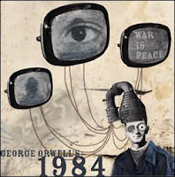
Wednesday, 14 September 2016

Imagery I Am Going To Use

Since there is quite a lot of imagery included throughout 1984; I'm not going to use all of it. However, I will definitely be creating at least 4-5 mock up pieces and deciding on the one I like the best. Though at that point, I'll have a clear idea, as I'll experiment on a few different things, such as logos, a couple poster/propaganda pieces; though also a simplistic piece, of course, still including a few photo manipulations. However, I feel this one would just be remaking a scene; which could definitely be showing off some of my photography skills.


Any way, let me get onto the imagery I wish to use in these pieces and my final piece:


  • Colour Bars
  • Television Screen Static
  • Black Sheep Symbolism
  • The All Seeing Eye
  • INGSOC
  • The Ministries
  • The Place Where There Is No Darkness
Since all of these have already been explained previously, I'm not going to go into that again, there's no need. I'm just briefing myself over all of the symbolism and such that I AM going to use. (To be fair, most of the one's I covered are actually here. hehe.)


Tuesday, 13 September 2016

True Propaganda Artists

Jim Fitzpatrik

Image result for jim fitzpatrick propaganda

Though this is seemingly the only piece of propaganda that I could find by Fitzpatrik; it is still quite interesting, and a general, stereotypical piece of propaganda. I am noting how the general colours of MOST pieces of propaganda are in the specific colours: Red, White, and Black. Whilst I am experimenting, and creating my final pieces, I am going to take this into consideration.

I like the simplicity of Fitzpatrik's style; and this would be rather easy to recreate, I can imagine. However, I think I am going to generalize propaganda; which is why there are multiple artists on this page, to create a spectrum of what true propaganda is.
Hans Schweitzer


Image result for hans schweitzer propaganda

Image result for hans schweitzer propaganda

Image result for hans schweitzer propaganda

Image result for hans schweitzer propaganda


This German propaganda is a little different; as it is not following the stereotypical propaganda colours or simplicity. Of course, it is still quite simple, though varies a little more than the other artists I have researched. Schweitzer's art comes in a little more detail than the others that I have listed. However, I am not knocking the style, as it is another for me to consider.

However I fear this could be a little too complex and somewhat difficult to recreate. I will still experiment and give it a go, though I am uncertain whether not I will work in this particular style.

Dimitri Moor


Image result for dimitri moor propaganda


Image result for dimitri moor propaganda


Image result for dimitri moor propaganda

Moor's work is a lot more stereotypical once again, with the general simplicity and colour scheme of stereotypical propaganda. Once again, it is in the style of propaganda that would be somewhat simple to recreate, with very basic detail and somewhat pinted in appearance detail. Of course, there is little detail, which is what I am trying to get at.

So far, both Moor and Fitzpatrik are propaganda artists I am going to relate my work to a little more, as much of this stereotypical propaganda can work for linking into Orwell's 1984.


Harald Damsleth
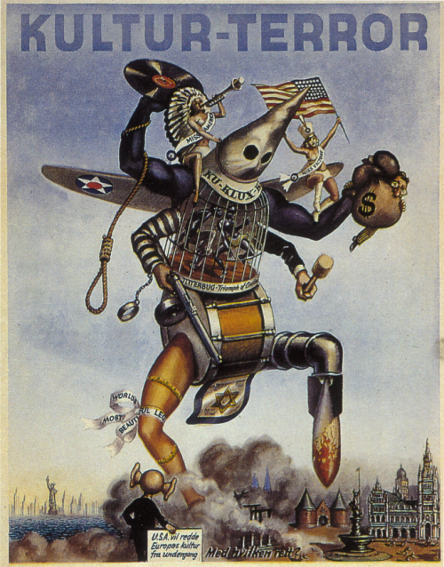

Image result for harald damsleth propaganda

Image result for harald damsleth propaganda

Image result for harald damsleth propaganda

Image result for harald damsleth propaganda

Image result for harald damsleth propaganda

I believe that Damsleth's work is for Norwegian propaganda. However, once again it is a little more detailed and somewhat similar to the style of Schweitzer's propaganda. This is a different type of propaganda, I belive, and not as simplistic as most of the other artists I have looked at. Again, faf too detailed, and I do not feel like this is what will link well with my original idea.
Valentina Kulagina

Image result for valentina kulagina propaganda


Image result for valentina kulagina propaganda
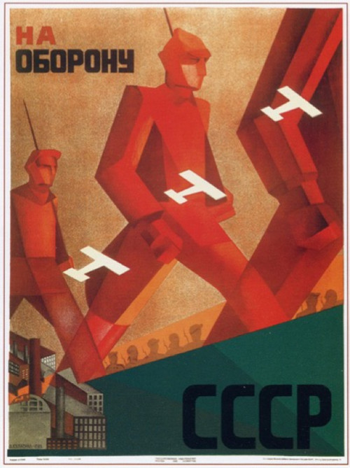
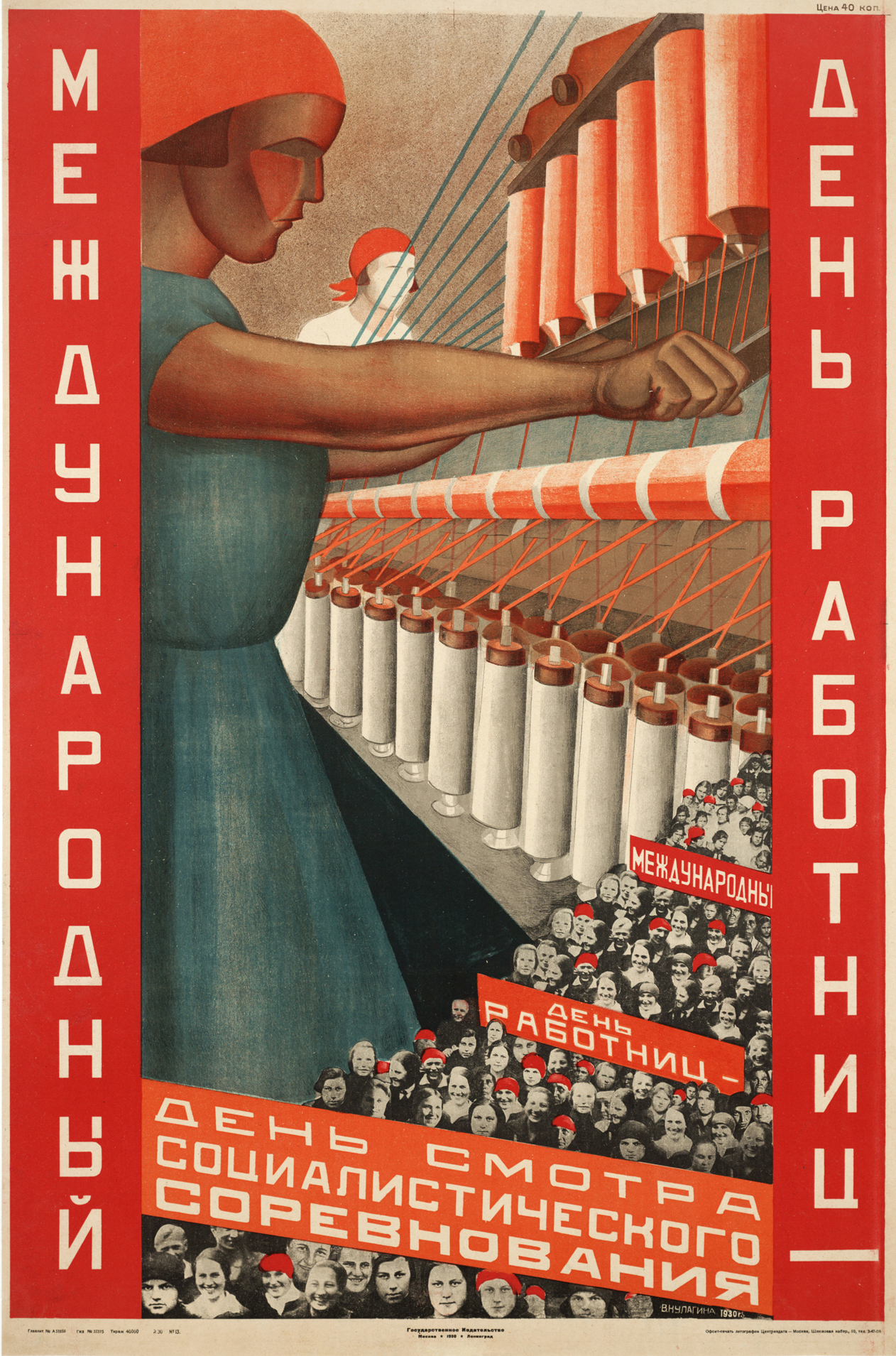
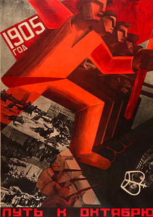
Finally, we have another partially simplistic and stereotypical propaganda artist. But I do like the style of which Kulagina's works are done. They are very simplistic, though don't entirely follow the colour scheme of stereotypical propaganda pieces.

Saying that, this propaganda seems as if it would be somewhat simple to recreate, as well as having the bonus that it'll work for 1984 propaganda related work. I am definitely going to link back to Kulagina's work; along with the work of Moor and Fitzpatrik.

Conclusion to True Propaganda

Since it is most likely that I am going to use propaganda for my final piece of work; I am going to keep a general checklist of the conventions I need to keep in mind, and remember to constantly make sure I am keeping an eye on them.

  • Red, White and Black colour scheme.
  • Simplistic style
  • Big,bold texts
  • Usually one larger main image; pointing towards the person viewing it
  • Dramatic contrasts
  • Persuasive


Andy Warhol

Andy Warhol


Image result for Andy Warhol Posters

Image result for Andy Warhol Posters

Image result for Andy Warhol Posters

Image result for Andy Warhol Posters


Image result for Andy Warhol Posters

Image result for Andy Warhol animals

Image result for Andy Warhol animals

Image result for Andy Warhol people

Image result for Andy Warhol people

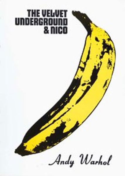
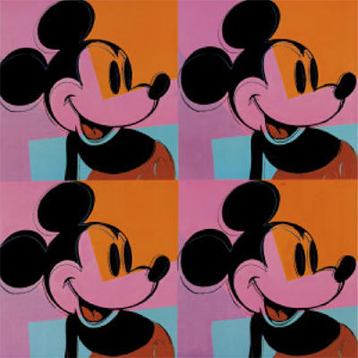
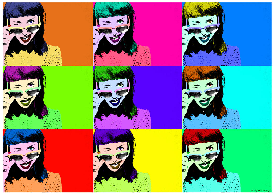
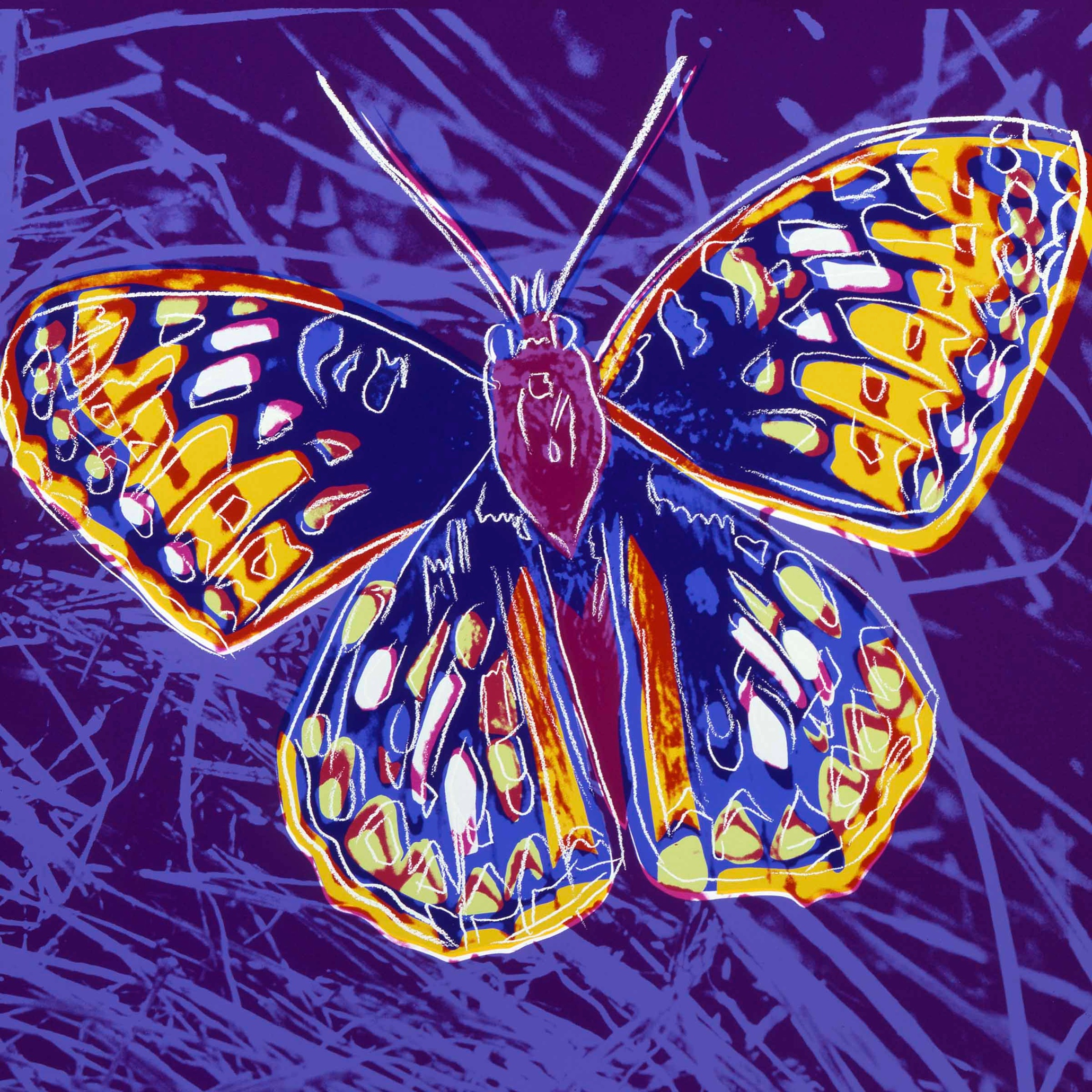
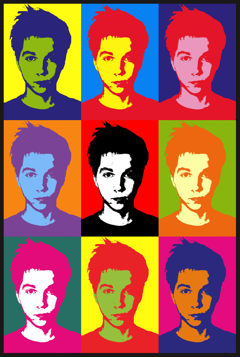
I chose to look at Andy Warhol's work, for the simple fact that it fits in with the idea of propaganda. I like how simple it appears; and also that it'll be something possible to complete in photoshop. However, I feel that if I did it in this style, I may have to complete my final piece physically; as opposed to digitally.

The colours in Warhol's work are very simple, seeming to range from between 3-6 colours; excluding different shades of the same colours. Again, since my final piece may very much end up in the style of propaganda, Warhol's art is perfect to link into my work.

Pop art as a genre alone is typically comic book in appearance, and at times, propaganda like. Andy Warhol's works explore the relationship between artistic expression, celebrity culture and also advertisement.

These works flourished by the 1960's.

Once again, I feel this is a art style I'd be comfortable looking at; and pop art as a whole is a genre that can be completed digitally through photoshop and other means. I may experiment with this style a little later on once I have taken the photographs that are required. I may also talk about both Warhol and pop art once I have completed my photoshoots and moch ups; as well as experimentation.


INGSOC, The Ministries and The place where there is no darkness

INGSOC

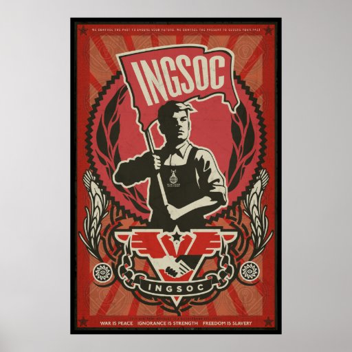
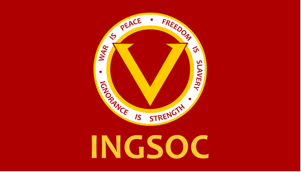
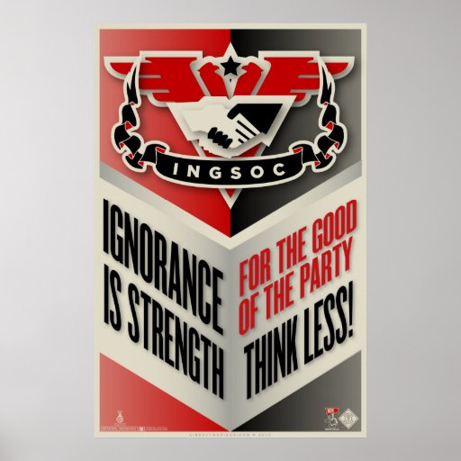
There really isn't much to talk about with INGSOC; at least, not in my eyes. I simply like the propaganda style of the posters, and also the logo and how much of an important symbol it seems to be through the story. I think I may end up using it; though I think that'll definitely be decided for sure through my mock up pieces.
Image result for ingsoc postersImage result for ingsoc postersImage result for ingsoc postersImage result for ingsoc posters

The Ministries

Image result for 1984 ministries

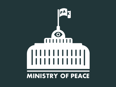
This is the same case as the INGSOC imagery, the propaganda style. I do find these two pieces of imagery interesting, and may use them, though once again, this will be fully decided when I am working on my mock ups.


Image result for Orwell 1984 Ministries

Image result for 1984 the ministries art


Image result for 1984 ministries

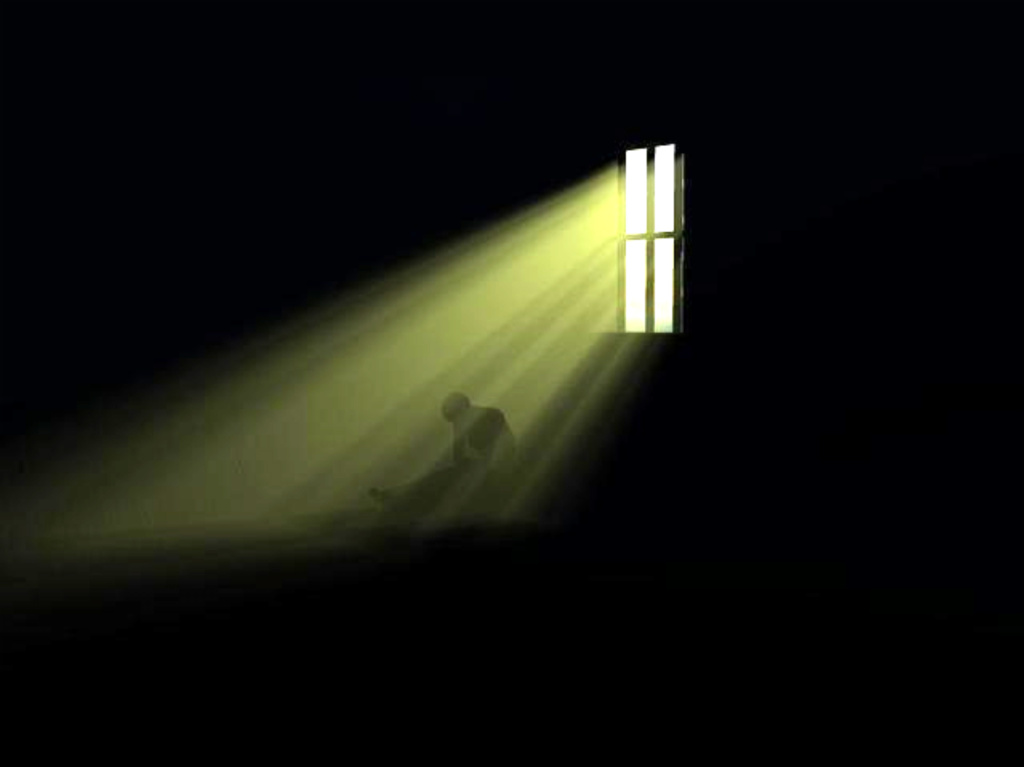
The Place Where There Is No Darkness

One final thing; though certainly not least, is the imagery of this, and it is very interesting. I'm going to consider it, as it could be something to include in the background of a mock up, as a main image, or even part of my final piece.

Image result for the place where there is no darkness art


Image result for darknes with one light

Image result for darknes with one light


Emmanuel Goldstein and Sheep Symbolism

Emmanuel Goldstein

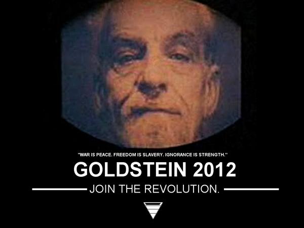
Here we are once again with another page of ideas and concepts that I'm going to include in my final piece. Emmanuel Goldstein, the potential antagonist in 1984; if you will. This is definitely most certainly one of the things I definitely intend to include in my final piece. Anyway, let me explain why.

Goldstein is the main image involved in the two minute hate; and I'll also note, invoking the hatred amongst the people in this world. Though, rebellion and such is seen as a punishable crime, Goldstein is ignored for his 'violence' and such. However, during the book., I feel as if he isn't the true villain, as such.

This is where I feel the 'sheep symbolism' is important, though, I'll explain this in a moment.


Image result for emmanuel goldstein art

Image result for emmanuel goldstein 1984

The Importance of Sheep Symbolism and Imagery

This does sound rather odd at first, though is actually a strongly held comparison, and is a very interesting comparison for Orwell to have made, and made clear. It is mentioned a lot that Goldstein looks like a sheep, that he is a sheep in some cases.

I feel that this could go in more directions than one in all honesty.

One of these, could be that sheep are the symbolism of innocence and peace. This of course could be what Orwell could have been trying to get at. OR!

The symbolism of a black sheep; a member of a family or group who is regarded as a disgrace to it. I feel this could actually be the bigger point being made.

However, going back to what I am researching and talking about; I do want this imagery to appear in my final photography piece. Especially the idea of a 'black sheep'. However, I'll return to this later on in my work.


Image result for Black sheep art

Image result for black sheep


The All-Seeing Eye, Big Brother and the Telescreens


The All-Seeing Eye

Now, though the All-Seeing Eye hasn't really been mentioned throughout 1984; it is clearly a
vague though obvious part of the symbolism within this story. With the fact that the Telescreens are always watching being an all important fact, along with the ministries being triangular, this is a somewhat notable piece of information.

Though even if this was not intended to be important, it is still something that I am going to be using, as it feels fitting with the idea that Big Brother is always watching you along with whomever is behind the Telescreens; seemingly on constant alert and watch. Again, relevant to the all-seeing eye, for the simple fact of being all-seeing.

Image result for the all seeing eye art

Image result for the all seeing eye art

Big Brother

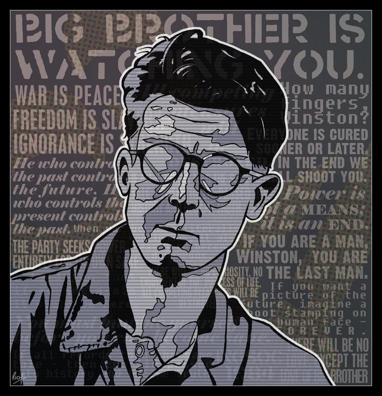
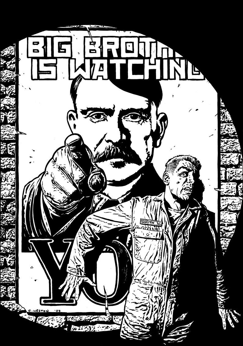
This symbolism links straight back to the idea of the all-seeing eye, although now more established and stuck to the story of the book. Big Brother is by far one of the biggest pieces of symbolism which appears in 1984. He is seen as a symbol of peace and safety, bringing a sense of calm along with him. Though, in my eyes, even though he is seen as the goody-good guy, the way Winston is described to feel towards this man is anything but what is expected.

Of course, with Orwell's interesting style of writing, it does make you wonder about this dystopian world. Anyway, enough of that. I find this symbolism  very interesting, and may end up linking it to my final piece of work.

Another thing I'll need to bring up later on in my research is propaganda; as this is heavily influenced on just that.


Image result for big brother 1984 art

Image result for big brother 1984 art

The Telescreens

Here is the final reason behind the concept of the all seeing eye being an important symbol behind 1984. The Telescreens. Now, these are just as interesting, an as we see rather early on in the novel, these are watching the occupants of the houses and streets 24/7. Again, something Winston is portrayed to dislike and avoid.

This I something I certainly want to include in my final piece for the REMAKE project. At the mention of these Telescreens, I immediately pictured two things. Both the colour bars error screen on a TV, and also the static of which appears on a television screen. And I feel these are two things of which I will most likely end up looking into further on in the project at hand.


Image result for telescreens 1984 art

Image result for telescreens 1984 art